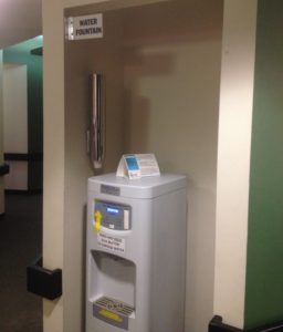
With the placement of the “water fountain” sign above, it is only visible when the actual thing it is pointing out is visible as well.
My ophthalmologist’s office has little signs that stick out perpendicular to the walls. These signs point out the restrooms, the check in window, the check out window, and so on. In most cases, they’re useful, like the signs for storefronts that stick out perpendicular to the sidewalk so that people leisurely walking by can locate the shops without having to turn their heads toward the facades.
However, the placement of this “water fountain” sign above renders it completely useless. People can only see the sign if the water fountain itself is in plain view as well. Under what scenarios would it conceivably provide any useful information? Perhaps if someone saw the water fountain but thought it was a droid from Star Wars and needed clarification, maybe under a vision condition in which people can only see the top of their field of vision clearly.
This awkward sign usage reminded me of the adage that if it needs a label, it is badly designed. The button panel of the water fountain also highlighted this quite clearly. Apparently, people have also been confused about the need to hold down the button. Proper use of perceived affordances would eliminate the questions of “what is this contraption?” and “how do I get it to dispense water?”.
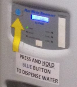
Instructions for how to dispense water. Which button do I press again?