Part of an ongoing personal project. Here are all posts on the subject. Also, here’s the code at this stage and the working demo.
At this point, I got the first bit of usefulness out of this tool – I uncovered more of the message than I was able to manually. I also realized that some bits of functionality that I thought were important are not important after all, but I realized I will need some new functionality such as saving my work.
Self Design
I have been doing a lot of programming on this project and not a lot of user research or usability testing. A year ago, I would have kicked myself at this point because this is bad practice and I should know better. On the other hand, I also realize that this project has an intended user base of one. I really am doing this in order to give myself a tool to decode this message, so researching others is not at all important here. Jared Spool would call this approach “self design”, which he documented in his post, 5 Design Decision Styles.
That said, I have been doing something akin to either an expert review or self usability testing (I’m not sure what to call it in this case) when I step back from the programming and put the application to use on decoding the message.
Micro Improvements
I found a couple of very basic improvements to make. In order to choose a word option, there were many tedious steps. 1: change focus to the select element, 2: choose an option, 3: change focus to the “next” button, and 4: activate the “next” button. This is a major pain when repeating the sequence word after word. Using the keyboard would make it much faster for me, but tabbing through all the elements in order to focus on what I wanted defeated the time savings. I solved this by adding a line to focus on the select element as soon as it’s created. Also, I put in a line to focus on the “next” button as soon as a word is chosen. If I need to change the word, I can hit “shift-tab” to focus back on the select element.
The Cursor
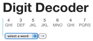
In order to reflect where one is in the order of this alphabet soup, I created a cursor in the UI and also paired it with a variable called cursorIndex. Also, one can now move this cursor (and its corresponding variable) by clicking on any character.
Having that cursor variable made setting up the rest of this cascade of functions (to generate the list of words and create the controls at the right point) go much smoother than I’d anticipated. I chained together all the necessary functions to run after a “click” event on a “character” div. In order to get this to work properly though, I had to filter out clicks on the “select” or “next” elements (which are inside the “character” div). Without filtering them out, event bubbling means that clicking on a “select” or “next” element would trigger the events attached to those elements and also trigger events attached to the parent “character” div. Firefox is having some issues with the way I filtered them currently, so that’s something to resolve later, but the approach is working in Chrome and Safari.
Also, the ability to move around the cursor at will basically eliminated the need for the “previous” button, so I commented out the code for that.
Message Discovered
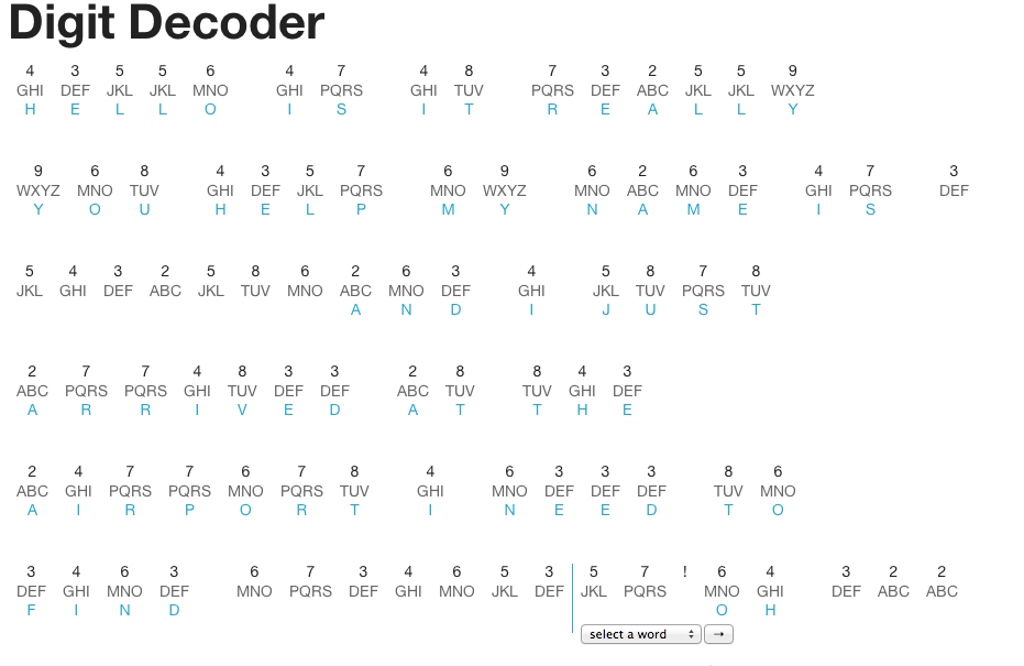
This is the exciting part. Here’s what I discovered so far in the message by being able to move the cursor around freely.
I was beginning to wonder if the naysayer on Yahoo Answers was correct – that there’s not much more real content to the message after the initial lines. Finding this additional content gave me some hope.
Next Steps
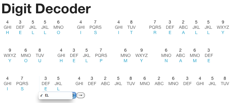
I realized that I will need the ability to clear a word that has already been selected. Currently, I can change the word to another matched word, but in cases like the below where there is no clear option, it will be important to be able to clear the word and move the cursor to another point.
Also, the big next step is adding the ability to save my work. At this point, I have been saving my work as screenshots, but clearly that’s not going to be viable at the scale of this lengthy message. I’ll be trying an approach like this.


