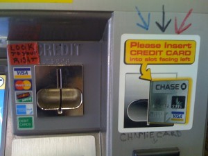
Here’s the handywork of a Boston subway attendant to solve a problem which is mainly out of his control.
The problem is: people at the self-service ticket purchasing stations don’t know which way to insert their credit cards. Errors here during peak hours can be a bottleneck in the system.
This problem could have been solved in a few ways:

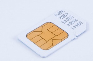
1. Constraints. Donald Norman introduced many people to the concept of constraints as a design convention. Basically, if you don’t want a user to do something the “wrong way”, make it impossible to do it that way. Also, if you visually indicate that it is impossible, you will most likely prevent the user from even attempting. This may seem difficult to do with something as two-dimensional as a credit card, but someone got it right with the design of SIM cards (left).
2. Flexibility. In this case, have four sensors in the card reader to accommodate the possibility of the stripe being in one of four possible locations. Of course, this would drive up the cost. Multiply the price of the sensor by the number of these kiosks in a transit system, then multiply it by four, and it will be significant.
3. Proximity (the P in the graphic design acronym CRAP). Another piece of this problem is that the label which demonstrates which way to insert the card is located far away from the card slot. So often the user doesn’t notice it when inserting a card. Then again, as Norman points out in The Design of Everyday Things, if something needs a label, it is badly designed.
The subway attendant’s solution was a noble but limited attempt to bridge the distance between the card slot and the label – a “Band-Aid” sort of solution to a problem that would ideally have been solved earlier in the design process.
The interesting bit is that it took the subway attendant (who watches people use the machines every day) to notice it. If the design team had tested their design earlier on, they most likely would have seen the problem when it could have been corrected in a more integrated way.