
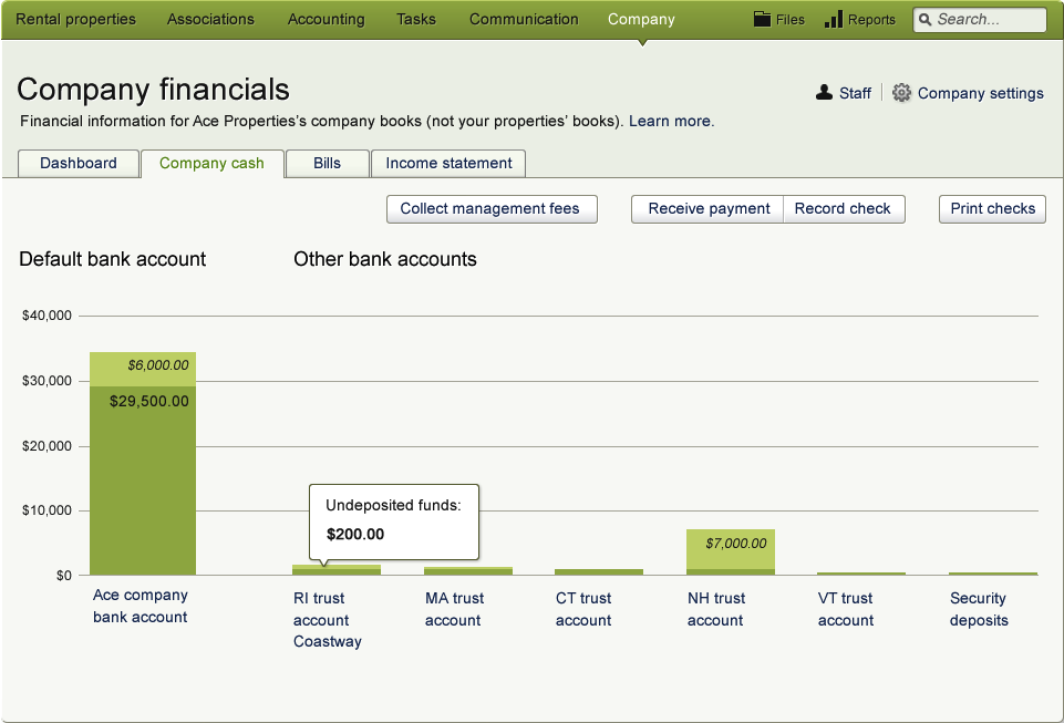
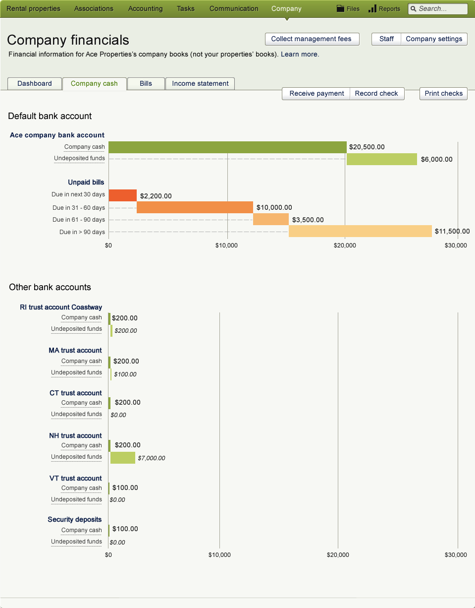
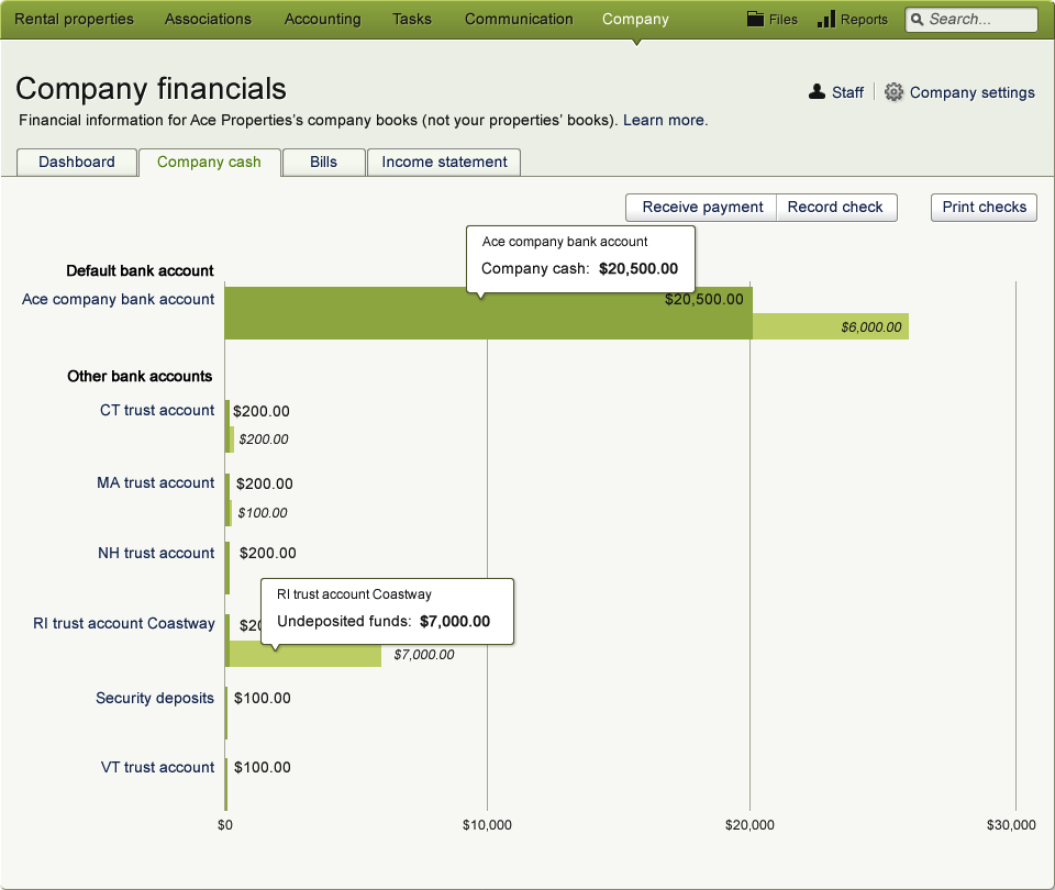
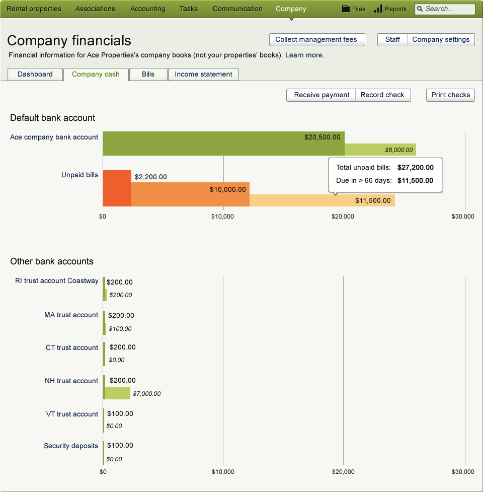
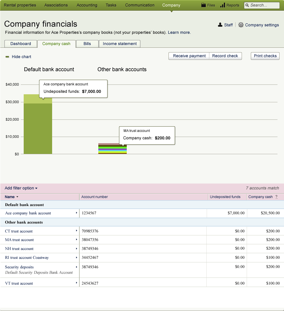
The initial tab of Company Cash shows the breakdown of money that the company owns across all bank accounts. The tab highlights the amount on the company’s primary bank account, which is the one used to pay bills.

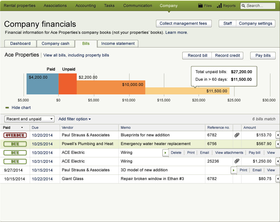
The Unpaid Bills tab itself highlights the total amount for unpaid bills due in the next 30 days, while the chart shows the key relationship of cash in the company’s primary bank account versus that total amount highlighted in the tab. The table details out specific bills.

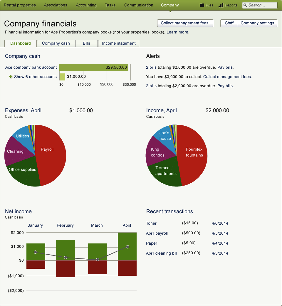
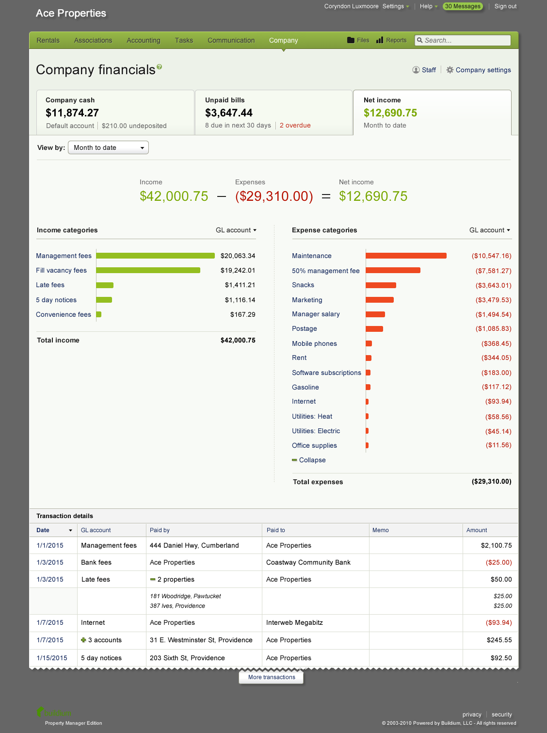
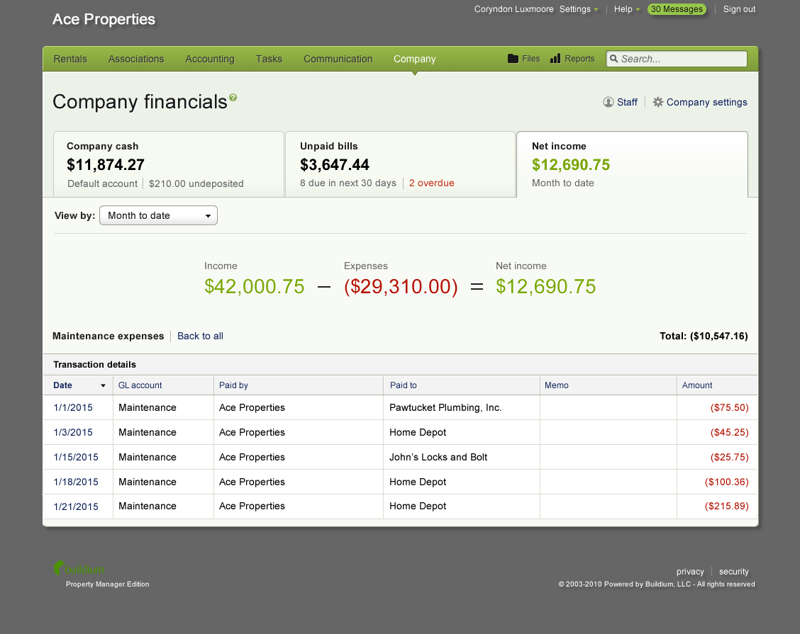
The Net Income tab surfaces the net income for the current month, and the page displays totals for income and expenses, bar charts for income and expense categories, and transactions that make up those subtotals.
My role
UX Lead, working with one other UX designer, one visual designer, one user research coordinator, one product manager, three developers, and two QA team members.
Activities
- Scenario identification and analysis
- Information architecture
- Wireframing
- Moderated, remote usability testing
- Detailed screen design
- Integration with system permissions
About Buildium
Buildium is a web and mobile application for property management. Over 10,000 customers depend on the software as the backbone of their business.
The problem / opportunity
Buildium was made to keep the books for the properties under management, but it wasn’t intended to track the finances for one’s property management company. Customers wanted an all-in-one solution to track both property and company finances together and see how the activities of property management impacted the company’s profit. “Ability to track my company’s books” was the second-highest voted suggestion in Buildium’s customer ideas forum. Buildium customer care had codified a cumbersome workaround, but that workaround had become a burden to support.
The solution
Along with our user research coordinator, we surveyed to identify the most important pieces of information people wanted to know in order to see the financial health of their companies. The other designers and I designed and tested three distinct approaches to displaying this information.
We designed a new “company” menu in the application that prioritized information to answer high-level questions like “How much does my company have in the bank?” and “Do I have enough money to cover upcoming expenses / bills?”, while allowing users to drill down into transaction-level detail.
Summarizing and revealing additional detail
The Net Income tab provides a good example of how we allowed easy access to the most important summary information while also affording detailed exploration.
The user can scan the tabs along the top to find key numbers like money in the company bank account, total amount of bills due soon, and net income this month.
Clicking “10 more categories” link reveals the additional categories that were initially hidden.
The user can parse individual transactions in the table at the bottom of the page, and if s/he wants to see only maintenance expenses, for example, to identify the transactions that make up the subtotal, clicking the “maintenance” label in the chart will filter the transactions table.
Alternate data visualization approaches
Below are some of the alternate approaches I generated that were not implemented.


