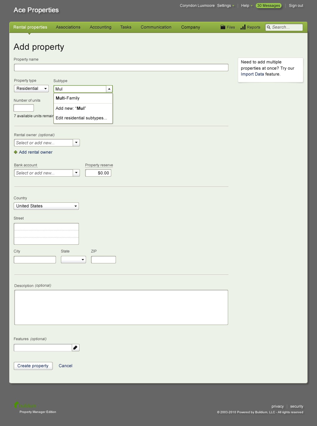
Add Property form
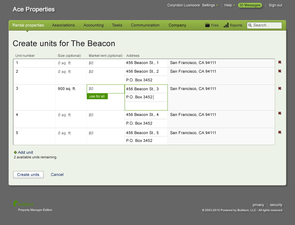
Add Units: step 2 of adding a property. The “use for all” button helped in the common scenario where rent or square footage was the same for all units.
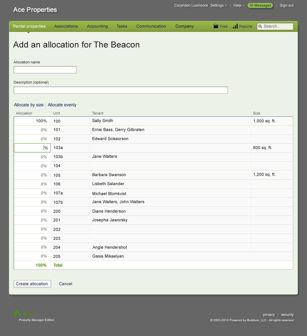
Add Common Expense Allocations
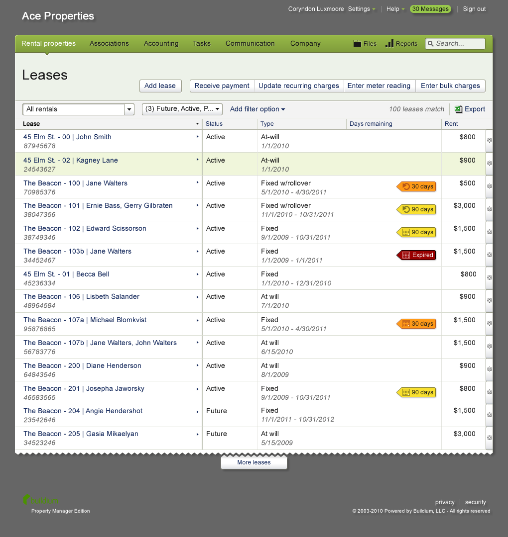
Leases table
My role
UX designer, one of two on the project, working with two developers and two QA team members. Responsible for redesign of forms.
Activities
- Analysis of user-generated database content
- Wireframing
- Collaboration with developers to build an HTML / CSS / JS prototype for testing
- Moderated, remote usability testing
- Detailed screen design
- Contributions to global pattern library
- Formulation of quantitative usability metrics
About Buildium
Buildium is a web and mobile application for property management. Over 10,000 customers depend on the software as the backbone of their business.
The problem / opportunity
The application had a recent UI overhaul, but some screens had been omitted, resulting in an inconsistent user experience.
The solution
We inventoried, prioritized, and redesigned screens in the new style. I tied together workflows that previously required navigating to disparate forms. I also provided ways to accelerate data entry within forms, based on common patterns of user-generated input found in the database. Finally, I introduced quantitative usability metrics to use for benchmarking the current state of the forms and later assess improvement or any degradation with the redesign.
Accommodating common patterns found in the database
In analyzing the user-submitted database content for a property’s units, we found that many units within a property were numbered numerically or alphabetically. The most common pattern was numerical. So on the “Add Units” screen, I set the default for unit numbering to go “1”, “2”, “3”, etc. If the user changed the first unit number to “A”, the screen automatically changed the following unit numbers to “B”, “C”, etc. It also accommodated lowercase lettering, so if the user changed the first unit number to “a”, the subsequent unit numbers became “b”, “c”, and so on. With this logic, I made a point not to overwrite any unit numbers that the user had already changed from the default. We user tested this and found that customers were pleasantly surprised by the flexible automatic numbering.