
Subscription Reminder Banner
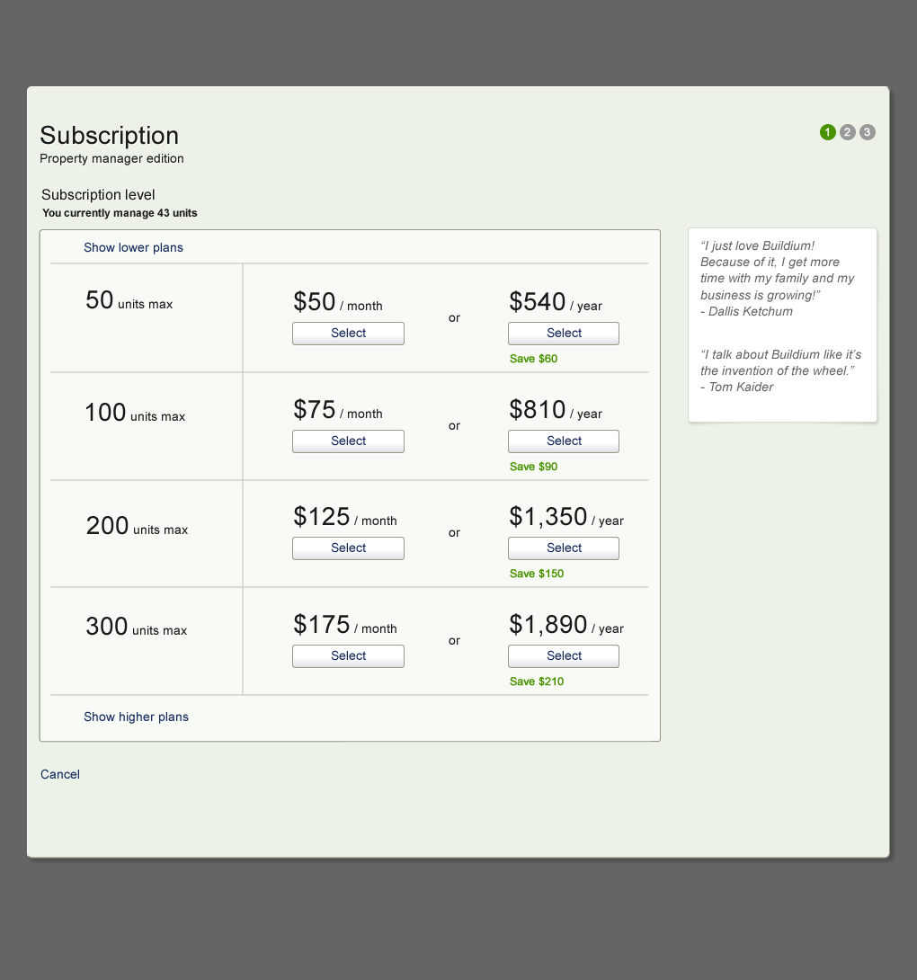
Pricing Page
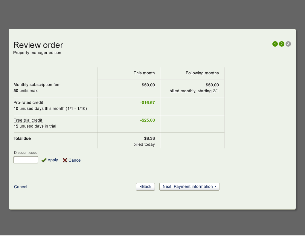
Subscription Review Page, breaking down the charges “this month” versus “following months”.
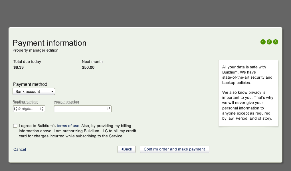
Subscription Confirmation Page
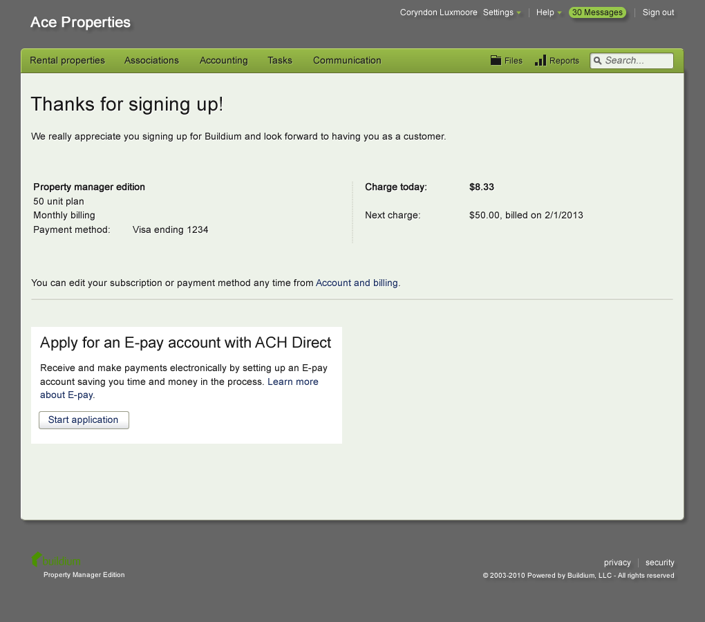
Thank You Page
My role
UX designer, one of two on the project, working with two developers and two QA team members.
Activities
- Conversion Optimization
- Information Architecture
- Remote, Moderated Usability Testing
- Live A/B Testing
- Contributions to Global Pattern Library
About Buildium
Buildium is a web and mobile application for property management. Over 10,000 customers depend on the software as the backbone of their business.
The problem / opportunity
Buildium’s existing subscription process caused confusion that impeded conversion. Also, there was an opportunity to increase conversion rates by targeting messaging to trial customers who were likely to drop off.
The solution
We identified the primary workflow and updated design and information architecture to address key points of confusion in the signup process. We designed a module to remind trial users that they must subscribe in order to continue using the software. We performed moderated usability testing on two updated approaches to subscription in order to find major issues. We then specified evaluation criteria and performed live A/B testing on the new design versus the existing one, and ran a statistical evaluation, which found the new design to be at least as successful as the existing design.
Encouraging signup by clarifying the charges
The billing system we used had a constraint that it processed subsequent subscription charges on the first of the month. Changing this was not feasible at the time, so working within those constraints, it meant that the first month would be pro-rated. We also had a policy of giving credit for unused days in the trial.
Prior to this work, the customer care team had gotten calls from potential customers who were confused about the charges this month versus those in following months. The updated screens made a point to clarify this at each step in the conversion process – highlighting “this month” and “following months”. The “Subscription Review Page” broke down the line items in detail.