
NY Times - a graphical display of basic forum functionality. Each sub-topic related to health care reform is depicted as a room with the size and silhouettes representing the number of comments made in the past 24 hours.

Washington Post – A Sphere of Influence. It’s astounding the way this graphic depicts the huge outer ring of lobbyists and their interests connected to the small inner circle of 23 members of the Senate Finance Committee.
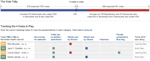
NY Times – House Vote Tally. Features a bar, depicting a tug-of-war for votes in red and blue. A table below shows relevant data about each congressman.
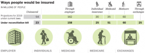
Washington Post - The Ways People Would be Insured. A clear depiction of the numbers of people insured in various forms and the numbers of uninsured currently and under the proposed reconciliation bill.
Washington Post – How the Senate Voted. It’s not entirely clear, but I assume this is the tally of Senate votes in late 2009. It’s interesting the way this graphic selects the factors of “campaign contributions from health industry” and “percent in state without insurance” to depict against the senator’s vote.

NY Times – A History of Overhauling Health Care. A nearly 100-year timeline of attempts (mostly unsuccessful) to reform the U.S. health care system, starting with Teddy Roosevelt’s campaign in 1912.