My role
UX Lead, working with a freelance UI designer, two front end developers, and one backend developer.
Activities
- Task analysis
- Information architecture exploration
- Wireframing
- Moderated, remote usability testing
- Detailed screen design
InCrowd – rapid market research platform
InCrowd provides tools and services for rapid market research in the healthcare industry. They had been known for their flagship microsurvey platform and their responsive panel of healthcare providers.
We’ve been doing this the hard way
Clients had been asking our client service team to perform international surveys on their behalf. The opportunities were valuable, but the process was time-consuming with much copying and pasting and much room for error. We created a tool to reduce the time it took our team to do this work and reduce the potential for mistakes.
How might the different variations of the survey be organized?
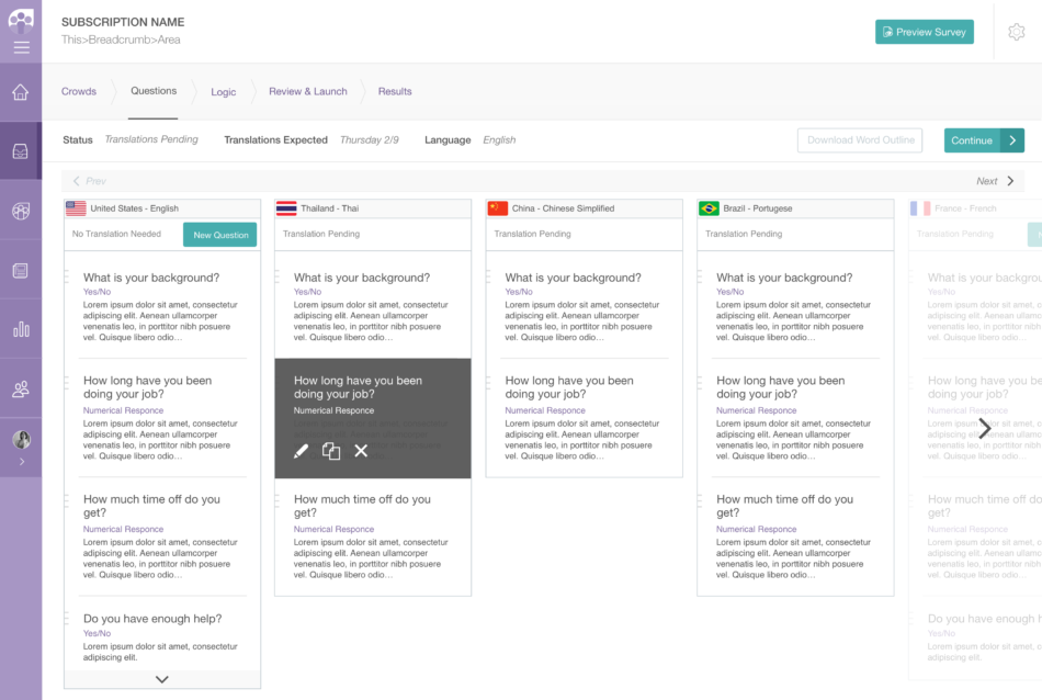
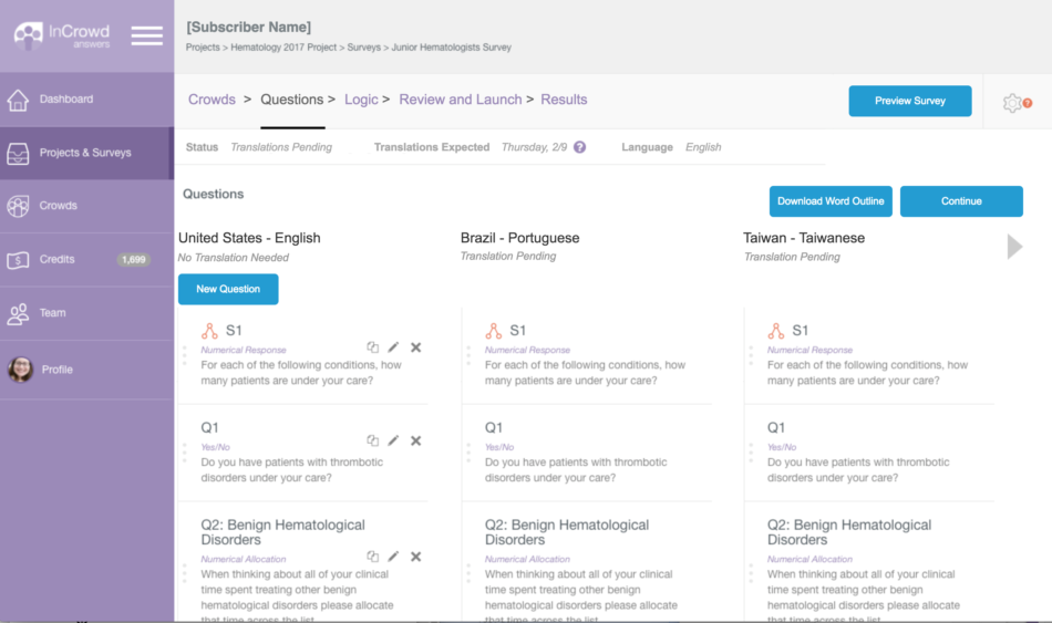
Our client service team members would start with a “master” survey and then split it into country-language variations. We had to decide how to arrange these variations in relation to each other (and to the “master”) and how to present the variations in relation to the survey creation steps. We explored a few ways of approaching this in the early wireframe prototype.
There should be no “master” after splitting into variations
Through usability testing with our client service team, we learned:
- They often make country-specific changes due to a cultural difference that needs to be accommodated or a drug that is not available in a given country.
- They find it useful to review a list of questions for each variation side-by-side before sending the survey for translation.
In both of these cases, presenting the “master” survey throughout the project caused confusion. So we removed the “master” survey from view once a survey was split into variations.
Converting any survey to a “global survey”
We allowed our client service team to start with a standard survey and then convert it to a “global survey” so that they can be flexible as client requests arise for in-progress work. See this task flow diagram for the primary workflow. This wireframe prototype walks through all steps of survey authoring and previewing. We used the side-by-side view to every step in survey authoring, and I worked with our UI designer to detail out some of the screens such as selecting a language and authoring a global survey. Results will appear under tabs separated by country/language variation.
Behind the scenes, we had an API integration with a translation partner to translate outgoing surveys into their target languages and translate back incoming open-ended responses and comments into English.
Now it’s more profitable and less prone to errors
Removing bottlenecks and potential errors for our client service team increased our capacity for this work and made the projects much more profitable. This also set the stage for a potential self-service global survey offering.


