The Modern Diner in all its Glory. Photo credit: Elizabeth Thomsen
There’s an ongoing debate about whether design should be upheld as a specialized profession requiring serious training or whether the basics, at least, can be taught to anyone easily (without $140,000 and 4 years in design school). Some maintain that everyone is a designer to some extent whether or not he/she realizes it. In 2006, students and faculty from Maryland Institute College of Art created a book called D.I.Y: Design It Yourself that sparked quite a controversy on the subject.
Here is an example of the “everyone is a designer” side of the argument.
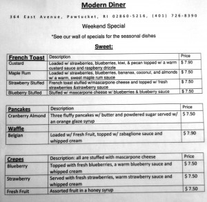
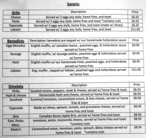
A menu can be thought of as a down-to-earth example of information architecture. Just about every menu does it – breaking up dishes into categories (appetizers, entrees, sides, drinks, desserts) and sometimes sub-categories (beef, poultry, seafood, vegetarian) and then individual dishes.

