My role
Human-centered design lead, working within a cross-functional product team.
Activities
- Service design
- Interaction design
- Technical discovery
- Research strategy
- Workshop facilitation
- Cross-team alignment
- Epic planning
Millions of Veterans apply for VA disability benefits online
Disability compensation is one of the most commonly-used benefits offered by The US Department of Veterans Affairs (VA). VA provides monetary compensation to Veterans with disabilities that stem from their military service. In 2023, VA processed over 2.2 million claims for disability compensation. VA offers Veterans several ways to apply for disability compensation. Applying online is one convenient method.
Veterans lacked clarity when applying for disability compensation claims online
We learned from discovery research that many Veterans had a poor experience when applying online. Even when claim submission went smoothly, Veterans lacked clarity and had incomplete information about the status of their claim. Their next step was often to call the contact center for basic status information. Questions about claim status were the most common reason for contacting support, which drained support capacity and increased wait times for others.
When claim submission didn’t go smoothly, like when there were backend system issues processing a claim, Veterans experienced confusion, burden, and additional cognitive load during a time when they were asked to recall traumatic events that led to their disabilities. Often the step to resolution was not clear, and many Veterans either gave up or took longer to successfully get their claims through submission. This added delays before Veterans ultimately got the benefits they had earned.
Gathering info on the current state
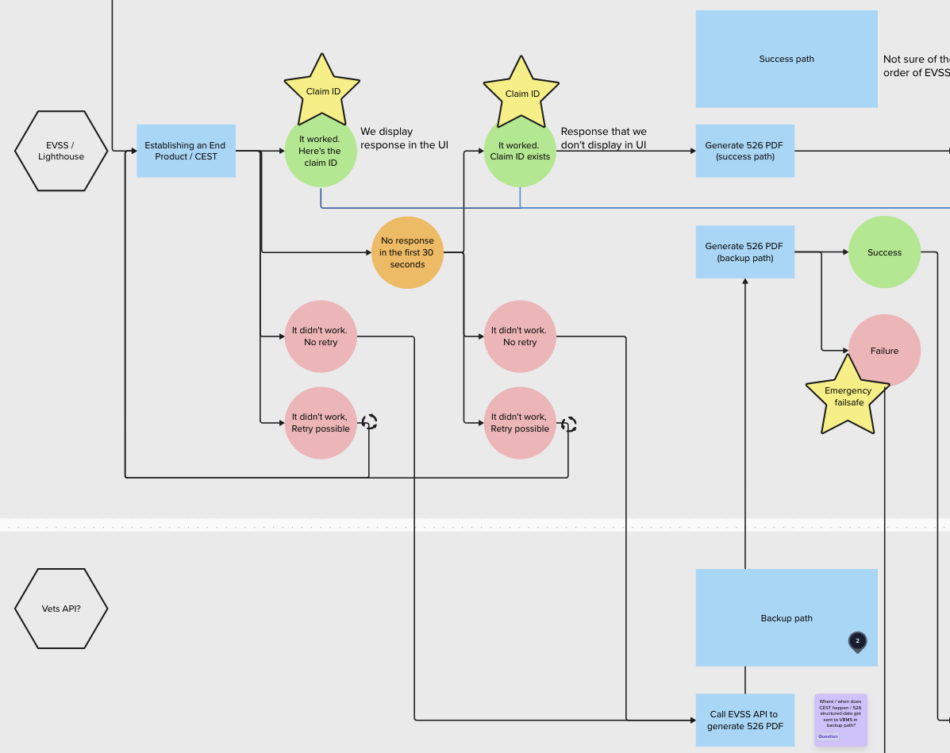
We investigated and documented the existing flow of a claim through various backend systems under all possible scenarios. This helped us understand what information we had access to, timing required to get certain pieces of information, and what potential changes would be feasible in the short term.

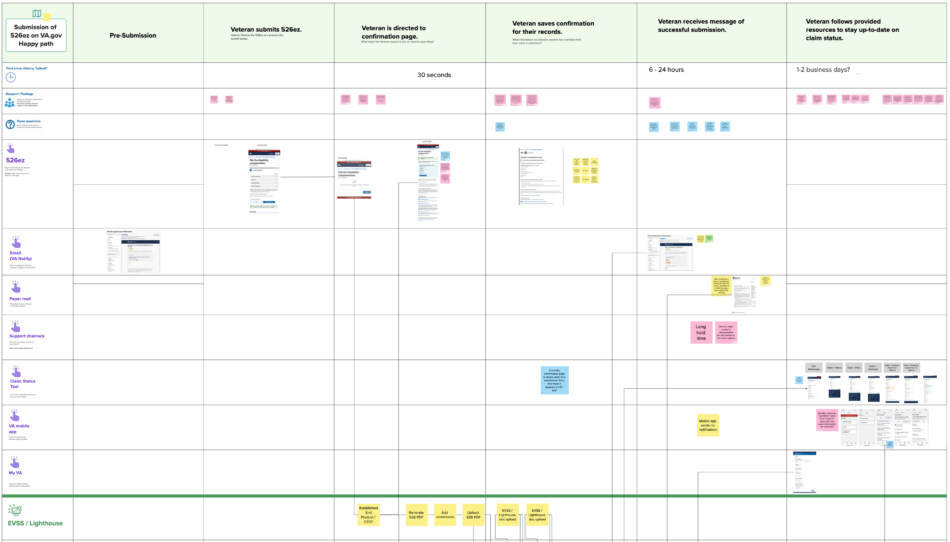
We then mapped the steps onto service blueprints (one per scenario) to align the backend processes with key steps in the Veteran experience. We mapped out elapsed time since submission in one row. We also used rows to split out parts of the front stage and back stage that we treated as separate products.

The service blueprints highlighted that Veterans expected a confirmation email immediately after they clicked “submit”, but the first confirmation email they got took 6-24 hours after submission to arrive, and it depended on a string of synchronous and asynchronous processes to complete before it sent. Also, in some cases, the confirmation was sent inappropriately since there was one asynchronous process that the system didn’t check for success before sending the confirmation.

Planning how to approach the problem
Since the product ecosystem was complicated and realizing much of the work depended on coordinating with other teams, it was crucial to plan this work thoughtfully so that we could deliver value to Veterans quickly and learn from early releases before sinking too much time into approaches that don’t work well.
We created a user story map with our product manager to organize epics. Each epic included a set of desired outcomes that covered multiple steps in the user journey.

We also met with other teams to learn from them and coordinate our solutions. These teams included the contact center and two teams who worked on parts of the product that Veterans used to check their submission status.
Next, we focused on designing a solution for the first epic, to provide Veterans timely and truthful information about their claim after submission.
How and when do we communicate submission status to Veterans?
I mocked up a few approaches to how the design could provide timely and truthful information about claim submission, using different design system components and integrating with other existing parts of the product.


We explored a few conceptual models of how we describe what is happening and what the current state of a claim submission is at various points. This language was key to being truthful about when a submission has ultimately succeeded.

I mocked up and prototyped our internally-refined design at this point.


Testing and refining our ideas
I worked with our researcher to plan evaluative research. Our research goals were to:
- Evaluate how effectively the conceptual model set clear expectations for claim submission timeline.
- Evaluate if submission touchpoints were timely and useful for Veterans.
- Generate ideas for the next epic to improve the claim record.
Our researcher led remote usability testing of prototypes for three scenarios and synthesized the findings. Among other details, we learned that:
- Veterans’ existing mental models for submission didn’t match the actual timeline and process that was in place. Participants expected electronic submission to happen instantaneously, not over 3 days. Also, many participants thought that the submission journey in these 3 days was a human-driven process rather than the actual string of asynchronous technical processes.
- The happy and backup path scenarios were easy to understand overall and left participants feeling confident that their submission was complete.
- Participants were confused about the timelines of “3 days for us to receive [their] claim” and “7-10 days for [their] claim to appear online”. Some added these two durations together and thought that they would have a decision on their claim in 13 days. Others thought the two durations were describing the same step and the fact that there were different durations listed was a typo.
- Most participants didn’t feel a need to check the status of their submission online once it was received.
We revised the design based on these findings. Below is a video walkthrough of the happy path scenario.

The balance of how much backstage information to surface
Much of this process (and much of the journey others before my team have traveled) involved balancing how much information to surface about backstage processes. We began with an idea to show more, and our research guided us to show less. We also learned that when we are obscuring backstage processes for the sake of simplicity, we must ensure that all scenarios that could arise are considered and work together seamlessly with what we communicate to Veterans.