My role
Research lead, working within a cross-functional product team.
Activities
- Journey mapping
- Analytics strategy
- Research strategy
- Workshop facilitation
The Blue Button 2.0 API allows Medicare enrollees to make use of their data
Blue Button 2.0 (BB2.0) is an API that enables software developers to build trusted applications, services, and research programs that benefit Medicare enrollees. Once an application integrates with BB2.0, enrollees can authorize the application to access their Medicare data. Common use cases of BB2.0 apps include:
- Personal health aggregators – enrollees can combine their claims data with health data from other sources and better track their health
- Insurance plan finders – enrollees can use their claims data to estimate future costs under different plans when shopping for insurance
- Clinical research studies – enrollees can provide their claims data to a clinical research study
- Health record sharing – enrollees can share their data with a provider, a new insurance plan, and/or a family member
Our main goal is expanding usage of the API so that more enrollees can benefit from access to their data.
Our current metrics were not helping us make product decisions
We had been tracking a few high-level usage metrics like:
- Enrollees served
- Third party applications that integrate with our API
- Volume of API calls
The problem was that these were all trailing metrics and didn’t provide any guidance on how to get closer to our goals of getting this data into the hands of more enrollees.
How might we get more leading metrics to inform our roadmap?
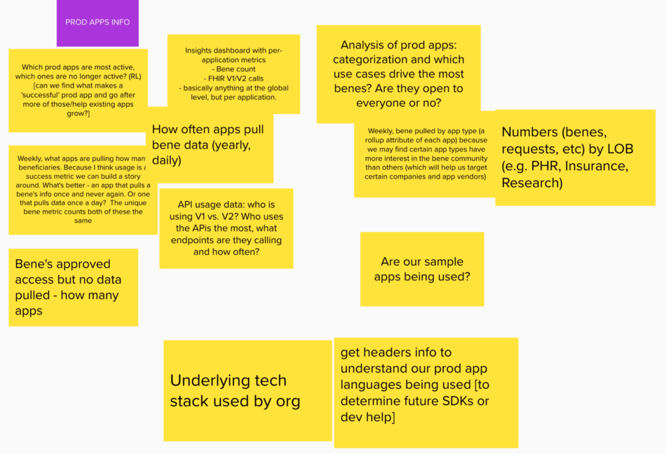
We brainstormed with the team to gather leading metrics that we could track. We asked, “what might we measure that can inform our roadmap?”
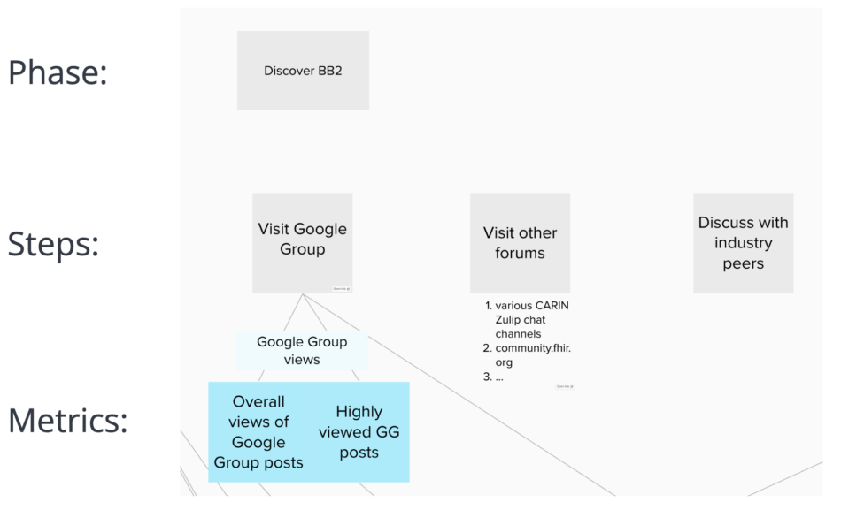
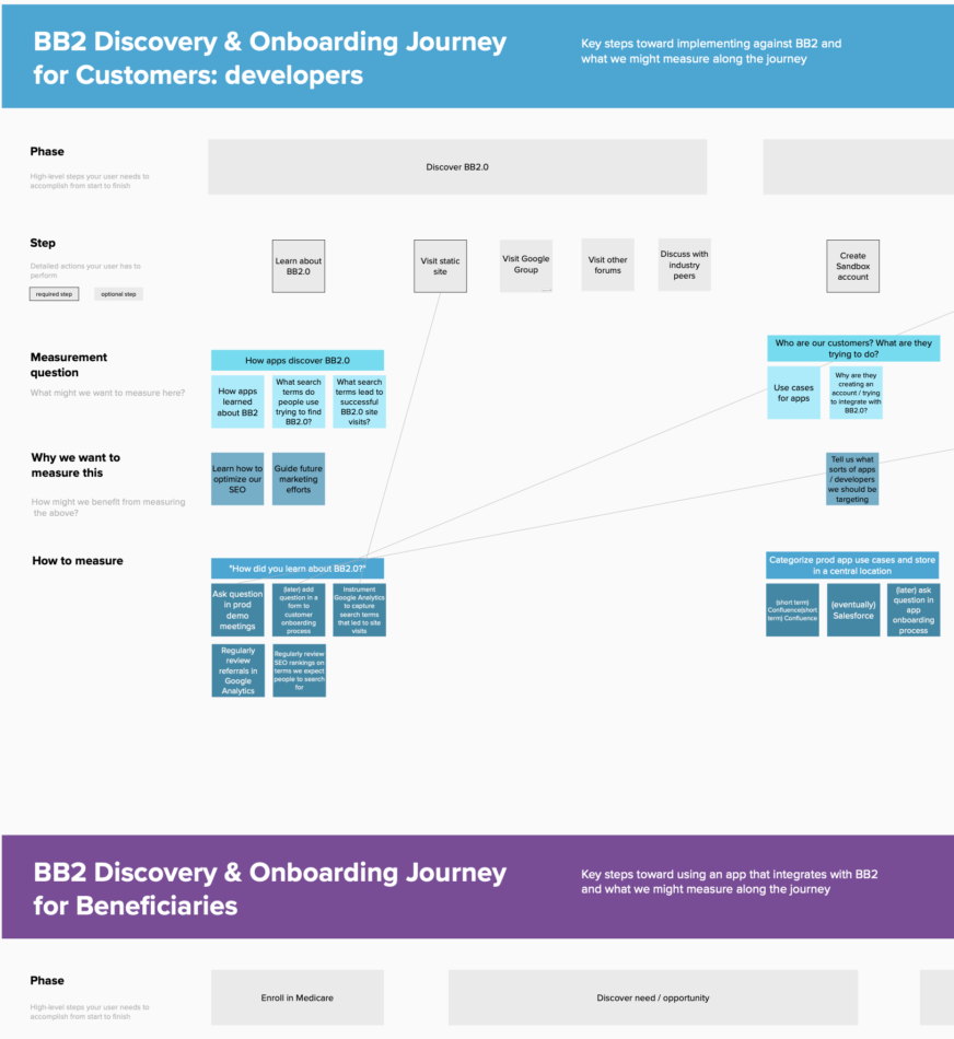
Connecting user journey steps to metrics along the way
With the goal of increased API usage in mind, we looked at the onboarding journeys: for app developers trying to integrate with BB2.0 and for enrollees trying to make use of their data in an app. We borrowed this approach from another API in our ecosystem.
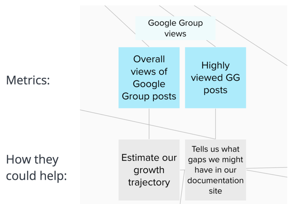
Identifying how these metrics could inform our roadmap
From this, we took it one step further and tied each metric to how it could help inform our roadmap.
Voting on top themes of metrics to track
We brainstormed more ideas of metrics to track than we could reasonably monitor, so we voted as a team on the most useful themes to track.
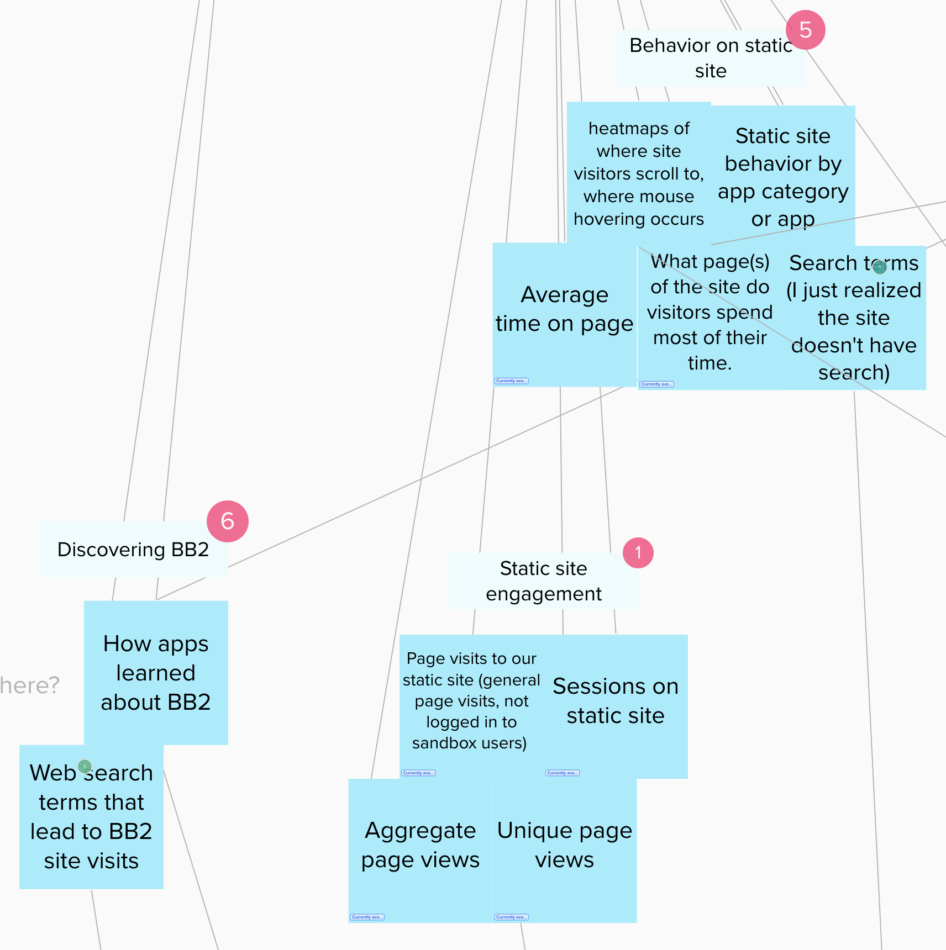
Specifying how to track these metrics
We detailed out how exactly to measure these points. I facilitated another workshop with the team to crowdsource ideas for this.
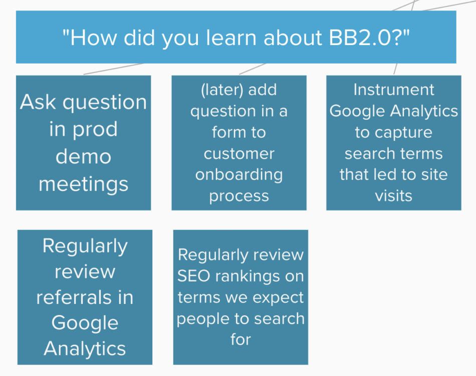
Some of the ways of measuring were qualitative, and some spun off separate research studies to understand them. Others were quantitative and answered in tools like Google Analytics or Amazon Quicksight, where we measure our API usage in detail. This exercise tied together what we are learning from qualitative and quantitative methods.
Establishing a new team ritual
From this, our product owner established a recurring team-wide analytics review meeting, where we use these journey map steps and metrics as a guide and also bring in any other metrics that stand out. We help each other make sense of what we are seeing, what it is telling us, and what actions we might take as a result.
Full journey map documents
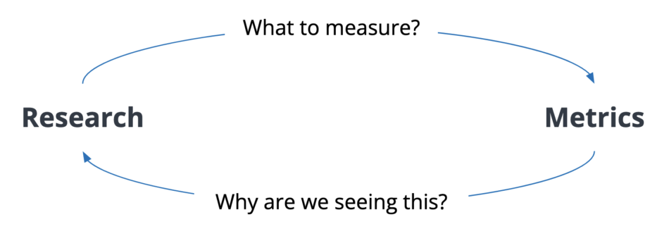
Research and metrics can feed each other
My manager wrote this on a sticky note to clarify the overarching idea for me, and it may be one of the most elegant sticky note diagrams I’ve ever seen.
